04
Marka's visual identity is built on clarity and intention. Every color, every line, every space serves a purpose — to make your brand feel coherent, memorable, and unmistakably yours. This section guides you through the core visual elements that define Marka: how to use the logotype, where to place elements in space, which colors carry meaning, and how typography and imagery work together to create a cohesive visual language.
Logo
Your logo is the visual anchor of your brand. It's the mark that people recognize across all touchpoints — from your website header to social media avatars to printed materials.
Marka provides flexibility: horizontal and initial versions let you adapt to different contexts without losing recognition. Learn when to use each, and how to protect its integrity.

HORIZONTAL VERSION


maximum reduction
Never scale your logo below these measurements. A logo loses clarity and impact when it's too small — it becomes a blur instead of a mark.
On screens, respect the minimum pixel size. In print, the millimeter equivalent ensures legibility regardless of viewing distance or printing method.
wordmark

On screens: 10 px
Printed: 4 mm
symbol

On screens: 8 px
Printed: 6 mm
spacing
Space is not empty. It's an active part of your visual identity. Maintain a clear zone around your logo — this breathing room prevents visual clutter and keeps your mark readable. The colored area shows the minimum exclusion space. Never place other elements inside this zone.

Colours
Color is emotion and meaning. Marka's palette is intentional: each color has a role and a context. Learn when and how to deploy them across design, messaging, and product.
Use these exact values in every application — consistency builds recognition.
#ff0000
Rgb: 255 0 0
cmyk: 0 100 100 0
#000000
Rgb: 0 0 0
cmyk: 0 0 0 100
#a1a1a1
Rgb: 161 161 161
cmyk: 0 0 0 70
#ffffff
Rgb: 255 255 255
cmyk: 0 0 0 0
Color Usage in Context
Colors don't live in isolation. Here's how Marka's palette comes alive in real design applications:


Typography
Inter is Marka's voice in type. It's clean, readable, and carries the same clarity as your visual mark. Use it consistently across headlines, body text, and UI.
The size, weight, and spacing rules below ensure readability and maintain Marka's distinctive aesthetic.
Usage rules
size
space
use
x
x
caption
x
x*1,5
paragraph
x
x*1,0
title
x
x*1,5
highlight
Example
AaBbCcDdEeFfGgHhIiJjKkLlMmNnOoPpQqRrSsTtUuVvWwXxYyZz
0123456789
Numbers
01234
Letters
AaBbCc
Presentation
Hi, I'm inter, the official font of marka.
Icons
Marka uses Feather Icons — a curated set of simple, purposeful icons that speak the same visual language as your brand.
Clean lines, geometric forms, and intentional use of negative space. Icons support communication — they don't replace it. Use them consistently across your design system.
Photography
Marka's photography style is authentic and intentional. It shows real people, real work, real moments — never stock-photo perfect.
Use photography to build trust and connection. Follow the style guide and the included prompts to source or generate images that feel unmistakably part of your brand.
STYLE AND COMPOSITION
DRAMATIC LIGHT
Directional, high-contrast lighting. Shadows are part of the composition, not a problem to fix.
INTENTIONAL IMPERFECTION
Motion blur, grain, and soft focus are welcome. The image doesn't need to be sharp to be precise.
NEGATIVE SPACE
Generous breathing room. Let the subject exist without competing with the frame.
HUMAN BUT STYLED
Real people, never stock. Candid in feeling, but intentional in framing.
THEMES AND ELEMENTS
THE CREATIVE PROCESS
Mood boards, sketches, references spread on tables. The work in progress is as compelling as the result.
PEOPLE AND PERSPECTIVE
Designers, founders, and builders — captured in thought, not performance.
STUDIO ENVIRONMENTS
Raw spaces, concrete, natural materials. Where brands are actually made.
BRAND IN USE
Printed materials, screens, signage — identity systems alive in the real world.
TENSION AND MOVEMENT
Images that carry energy. A body in motion, a beam of light cutting through a room.


Grid & Layout System
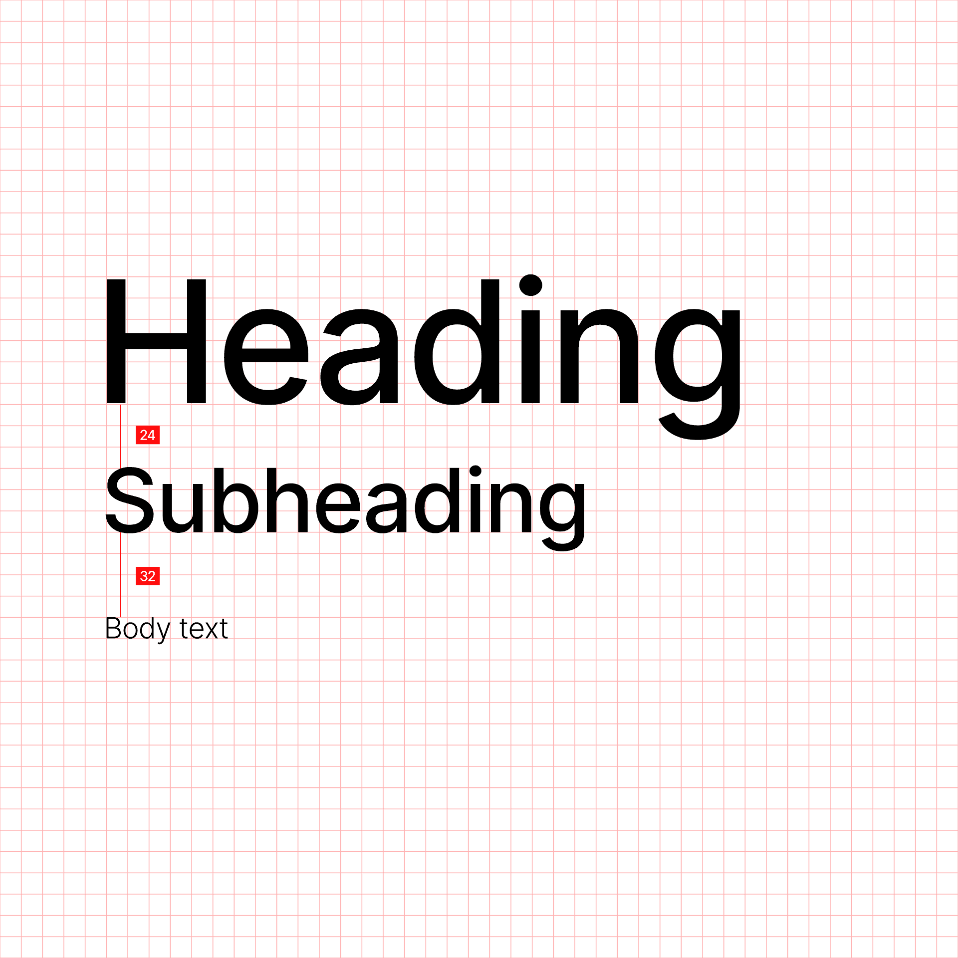
Consistency lives in the grid. Marka uses an 8-pixel base rhythm for spacing, sizing, and alignment.
Every margin, padding, and gap is a multiple of 8. This constraint creates visual harmony and makes your layouts predictable and intentional.


Download Brand Assets
Everything you need to apply Marka's identity is in your brand kit. Colors, typography, logos in multiple formats — ready to use across design tools and production.